Angular Animations Tutorial: Learn the Basics
When you build stuff in Angular, you probably pretty quickly discover that you want to add animations and transitions. They are an important aspect to any application now-a-days right? They help make the overall user experience feel nicer and can help to make it more intuitive too. Many times, we can use CSS to handle these animations, but Angular has a powerful animation framework baked right in that allows us to do a lot more than what we can with plain ol’ CSS. Alright, let’s get to it!
The Demo Application
Ok, here we have this demo application for the Vans shoe brand. You can see that we have this menu on the right-hand side, but it shouldn’t be showing right now.
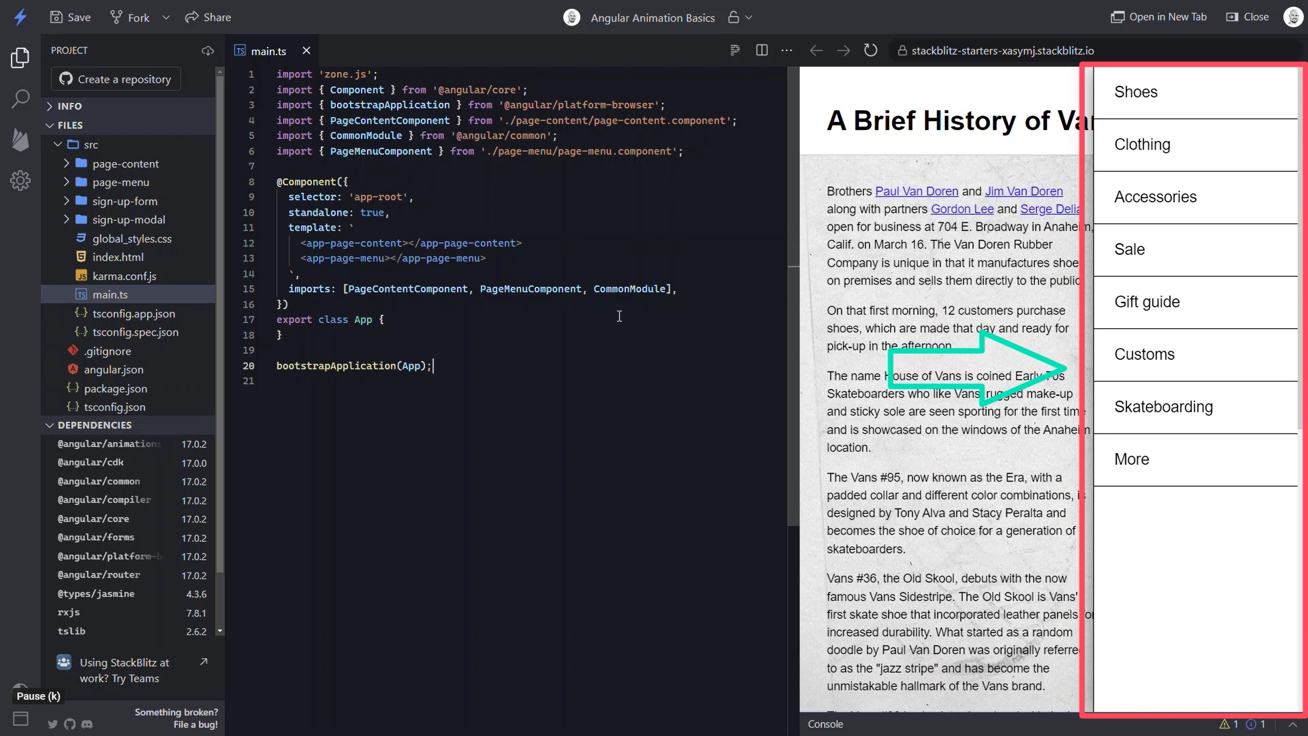
Instead, what I’d like to do is have it start out of view, and then when I click a “menu” button, I’d like to slide it in from the right edge of the viewport. Then, I’ll want it to do the opposite when I close it. So, I’m going to use Angular animations for this.
Enabling the Animations Module With the provideAnimationsAsync() Method
The first step is to enable the animations module. I can do this by adding the provideAnimationsAsync() method in the providers list for our application. And I’ll need to be sure it gets imported properly when I do this.
main.ts
import { provideAnimationsAsync } from '@angular/platform-browser/animations/async';
...
bootstrapApplication(App, {
    providers: [
        provideAnimationsAsync()
    ]
});
Ok, at this point I’m ready to create my animation.
Creating a State-based Animation in Component Metadata With the Animations Array
I add animations to my component using the animations array in the component metadata.
@Component({
    selector: 'app-root',
    ...
    animations: []
})
export class App {
}
Using the Angular Animations trigger() Method
Within this array, the first thing I need to do is add a trigger with the trigger() method. The first parameter in this method is the name of my animation as a string, in this case I’ll call it “openClose”. The second parameter is an array where I will add the rest of the animation instructions.
animations: [
    trigger('openClose', [])
]
I am going to be creating a state-based animation where the menu will start from a closed state and then transition to an open state. For this I’ll use the state() method.
Creating Animation States With the state() and style() Methods
The first parameter is the name of my state as a string, I’ll start with the “closed” state. The second parameter will be the style instructions for this state. I’ll use the style() method for this. This method expects an object of styles. I will only need a transform property with a translateX value of something large enough to push it out of view, let’s go with one hundred and twenty percent.
import { trigger } from '@angular/animations';
...
animations: [
    trigger('openClose', [
        state('closed', style({ transform: 'translateX(120%)' }))
    ])
]
Ok, that’s all I need for my “closed” state.
Now, I’ll just duplicate that state. I can then change the name on this to “open” and then I can change the translateX value to zero.
import {  state, style, ... } from '@angular/animations';
...
animations: [
    trigger('openClose', [
        state('closed', style({ transform: 'translateX(120%)' })),
        state('open', style({ transform: 'translateX(0)' }))
    ])
]
Ok so now I have both of the animation states. All I need to do now is add the transition animation between them. For this I’ll use the transition() method.
Creating a Transition Between Animation States With the transition() and animate() Methods
The first parameter for this function is a state change expression written as a string. My expression will be to transition from my “closed” state to my “open” state.
import { transition, ... } from '@angular/animations';
...
animations: [
    trigger('openClose', [
        ...
        transition('closed <=> open')
    ])
]
This expression with arrows and equals sign simply states that this transition will run either when switching from “closed” to “open” or from “open” to “closed”. Either way, this transition will run.
Now, if I only wanted to transition from “closed” to “open”, then I’d just remove the first arrow.
animations: [
    trigger('openClose', [
        ...
        transition('closed => open')
    ])
]
Now it would only transition when switching from “closed” to “open” and not from “open” to “closed”. Sometimes you may need that but here I want it to animate both ways. Ok, now the second parameter is an array of animations.
To run the animation, I will add the animate() method. Here I need to provide a string consisting of an animation duration, let’s go with one second, and I can give it an easing function to make the animation more dynamic, let’s go with “ease-in”.
import { animate, ... } from '@angular/animations';
...
animations: [
    trigger('openClose', [
        ...
        transition('closed <=> open', [animate('1s ease-in')])
    ])
]
Ok, now I have my state animation created, next I need to create a way to trigger the animation and then I’ll add it to my menu element.
Triggering the State-based Animation With Interaction Events
To trigger the animation, I’ll add a “menuState” property. I’ll make this a union type that will either be “open” or “closed” and I’ll initialize it to “closed”.
@Component({
    selector: 'app-root',
    ...
})
export class App {
    protected menuState: 'open' | 'closed' = 'closed';
}
Now, I’ll add the animation to my menu component. I’m going to bind this to my new “menuState” property.
<app-page-menu [@openClose]="menuState"></app-page-menu>
Ok, now let’s save a take a look at this.
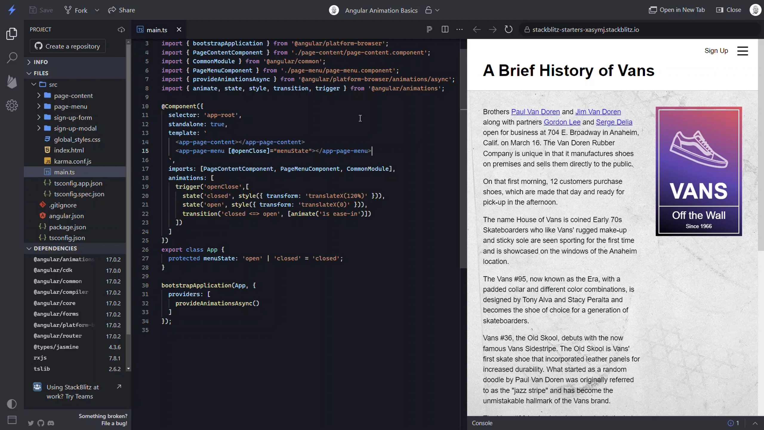
Wow, ok now we can see that the closed state is actually working because the menu is no longer here. Now what I need to do is toggle the menu “open” when I click the menu button in the upper right corner. Well, this button lives in the page content component and I have an EventEmitter that fires when it’s clicked called “menuClick”.So, when this event fires, I can set my “menuState” to “open”.
Ok, so the menu will animate as it opens now, but I still need to toggle it closed. For this, there’s actually a shield in the menu component that sits under the menu but on top of the rest of the content.
<app-page-content (menuClick)="menuState = 'open'"></app-page-content>
When it is clicked, it uses an EventEmitter to fire a “close” event.
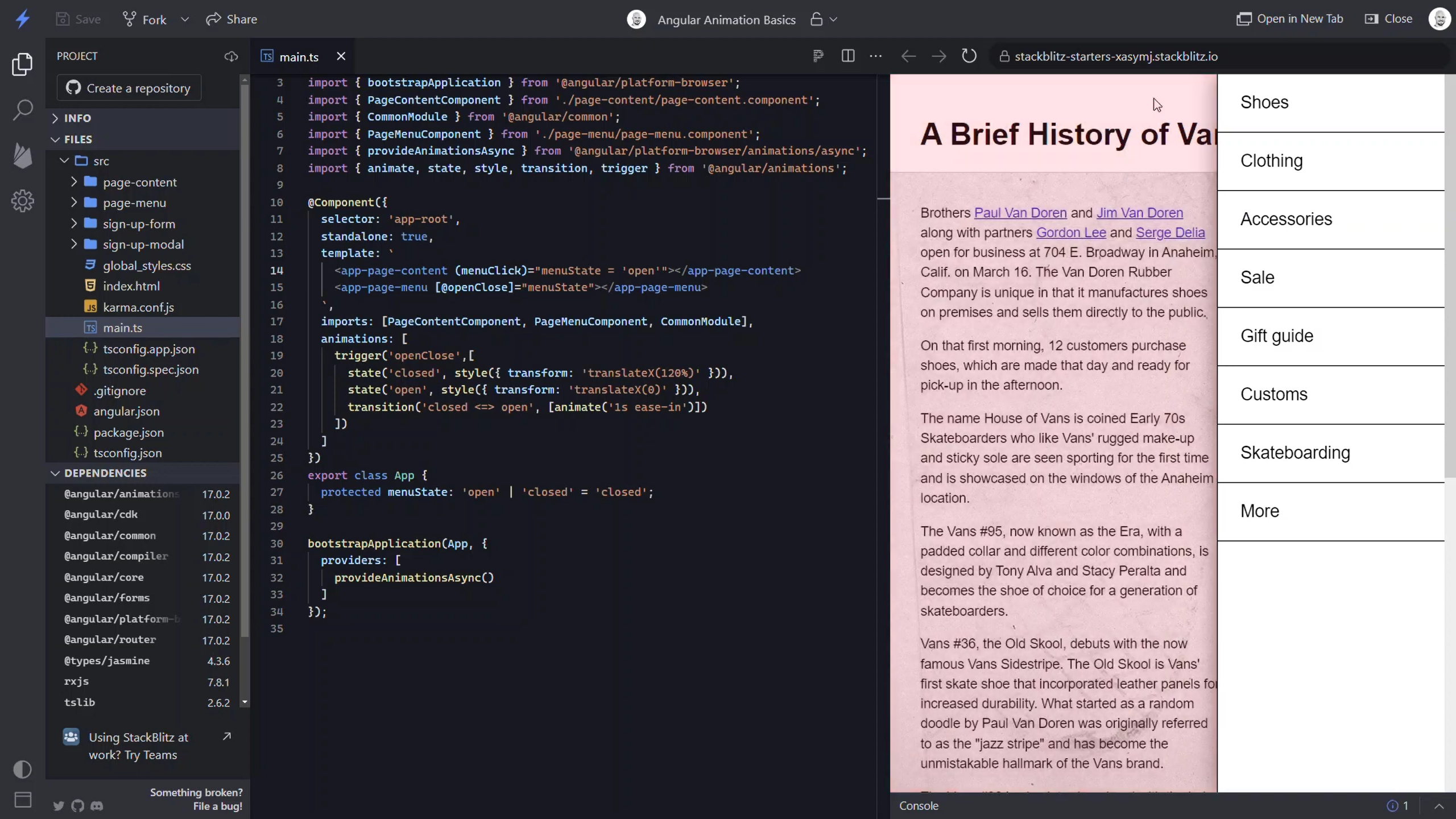
So, I can use this to set the “menuState” back to “closed”.
<app-page-menu [@openClose]="menuState" (close)="menuState = 'closed'"></app-page-menu>
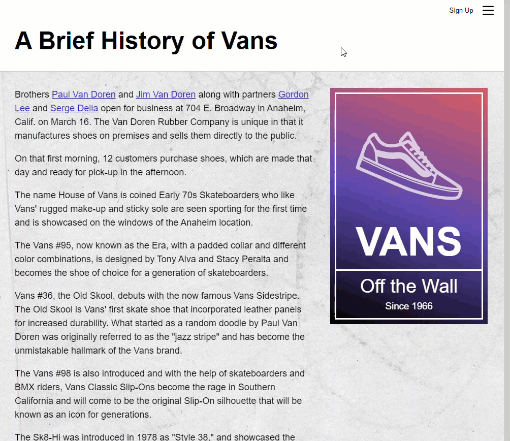
The Final Working Animation
Ok, now once we save and try it out we can see that it transitions properly as it opens, and then when we click outside it transitions as it closes.
Ok, so now you should have an understanding of how to create a basic state-based animation and how to use it. Now, there’s a lot to Angular’s animation framework so I’ll go ahead and stop here for now, but I will be creating several more posts covering much more on Angular animations very soon.
Want to See It in Action?
Check out the demo code and examples of these techniques in the in the stackblitz example below. If you have any questions or thoughts, don’t hesitate to leave a comment.
Found any of this Stuff Helpful?
If you found any this helpful and want to show some love, you can always buy me a coffee!