Angular CDK Overlay Tutorial: Learn the Basics
When building apps in Angular, you will likely need to trigger a modal or pop-up at some point. Sometimes this is easy and can be done with some simple CSS, but other times, it may be more complicated. You may need to append markup to the bottom of your document so that it can be placed on top of everything else. Or maybe depending on scroll position, a pop-up will need to open upward instead of downward. There’s lot’s of possible scenarios where you may need more than what’s capable with CSS by itself and that’s where the CDK Overlay Module comes into play.
In this post we’ll look at how we can use the CDK Overlay Module to create a globally positioned modal that’s placed on top of everything else and centered within the viewport. And to contrast, we’ll create a pop-up connected to a button that will automatically position itself within the viewport based on scroll position. Alright, let’s get to it!
The Angular CDK Overlay module is really powerful and provides many features. And this means there’s a lot to know and understand. The aim of this post is to demonstrate a basic set up for two common types of overlays, modals and pop-ups. Since there’s so much to cover within the Overlay module I will be creating posts of more advanced Overlay module features in the future, so keep an eye out for those. For now though, let’s start with a basic modal example.
Creating a Modal With the Angular CDK Overlay Service
Here we have this list of NBA players. In the upper right corner of each player, we have this button.
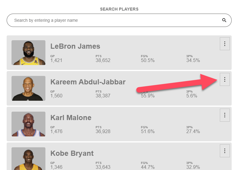
When we click this button we want to open up a modal to display more information about the specific player. This is something that is fairly easy to do using the CDK Overlay module.
How to install the Angular CDK
But, before we can use it, we first need to install the Angular CDK which we can do with this command within our Angular app:
npm i @angular/cdk
How to import the Angular CDK Overlay prebuilt CSS
After we have it installed, we will want to include the overlay-prebuilt CSS file from the library. It provides some basic styles in order to create modals and pop-ups that work correctly. I normally include it in something like the global stylesheet for the Angular app, so let’s import it there.
global_styles.scss
@import '@angular/cdk/overlay-prebuilt.css';
Ok, now we’re ready to wire up our modal. The first thing we need to do is inject the Overlay service into our constructor so that we can use it.
player.component.ts
export class PlayerComponent {
    ...
    constructor(private overlay: Overlay) {}
}
Now, let’s create an openModal() method that we’ll call on click of our button. Within this method, first we’ll create our overlay using the create() method from the service. This method will create an overlay and return the reference to it, so we’ll set it as a variable named overlayRef, since that’s what will have after calling create().
export class PlayerComponent {
    ...
    protected openModal() {
        const overlayRef = this.overlay.create();
    }
}
Ok, at this point we’ve created it, now we need to attach some markup to the overlay. So we’ll use our overlayRef variable and we’ll call the attach() method. This method has a parameter where we need to pass a CdkPortal.
export class PlayerComponent {
    ...
    protected openModal() {
        const overlayRef = this.overlay.create();
        overlayRef.attach();
    }
}
This template portal will need to wrap whatever markup we want to display in our modal. Before we can add this portal, we first need to import in the Portal Module.
...
import { PortalModule } from '@angular/cdk/portal';

@Component({
    selector: 'app-player',
    imports: [..., PortalModule]
    ...
})
Ok, now we can switch over to our component template. We’ll add an ng-template. On this ng-template we’ll add the cdkPortal directive. And within this ng-template let’s add our player details component. This component has an input where it takes in a player object, so we’ll pass it our current player.
player.component.html
<ng-template cdkPortal>
    <app-player-details [player]="player"></app-player-details>
</ng-template>
Now, we also need to import this player component, so let’s do that real quick.
player.component.ts
...
import { PlayerDetailsComponent } from './player-details/player-details.component';

@Component({
  selector: 'app-player',
  imports: [..., PlayerDetailsComponent]
  ...
})
Ok, the next thing we need to do is access the portal that we just added in the template so that we can pass it to our attach method. We can do this using the Angular View Child decorator. And for the @ViewChild, it’s selector will be the CdkPortal. We’ll call this property portal, and we’ll type it to CdkPortal as well.
import { CdkPortal, PortalModule } from '@angular/cdk/portal';

export class PlayerComponent {
    @ViewChild(CdkPortal) portal!: CdkPortal;
    ...
}
Now that we have a handle to the portal, we can simply add it to our attach method.
export class PlayerComponent {
    @ViewChild(CdkPortal) portal!: CdkPortal;
    ...
    protected openModal() {
        const overlayRef = this.overlay.create();
        overlayRef.attach(this.portal);
    }
}
And the last thing we need to do is call this open modal method when the button is clicked. So, back in our component template, on the button we bind to the click event, and then we call our method.
player.component.html
<button (click)="openModal()">
    ...
</button>
Ok, now let’s click our button and take a look.
And there it is, the click opens the modal with our player details.
So, this is pretty cool, but at first glance this may not seem like anything special, but let me tell you it actually is. If we inspect the modal, we can see that the markup for our player details is actually getting injected into a container at the end of the body. This is pretty crazy since our player component is up above within the app component.
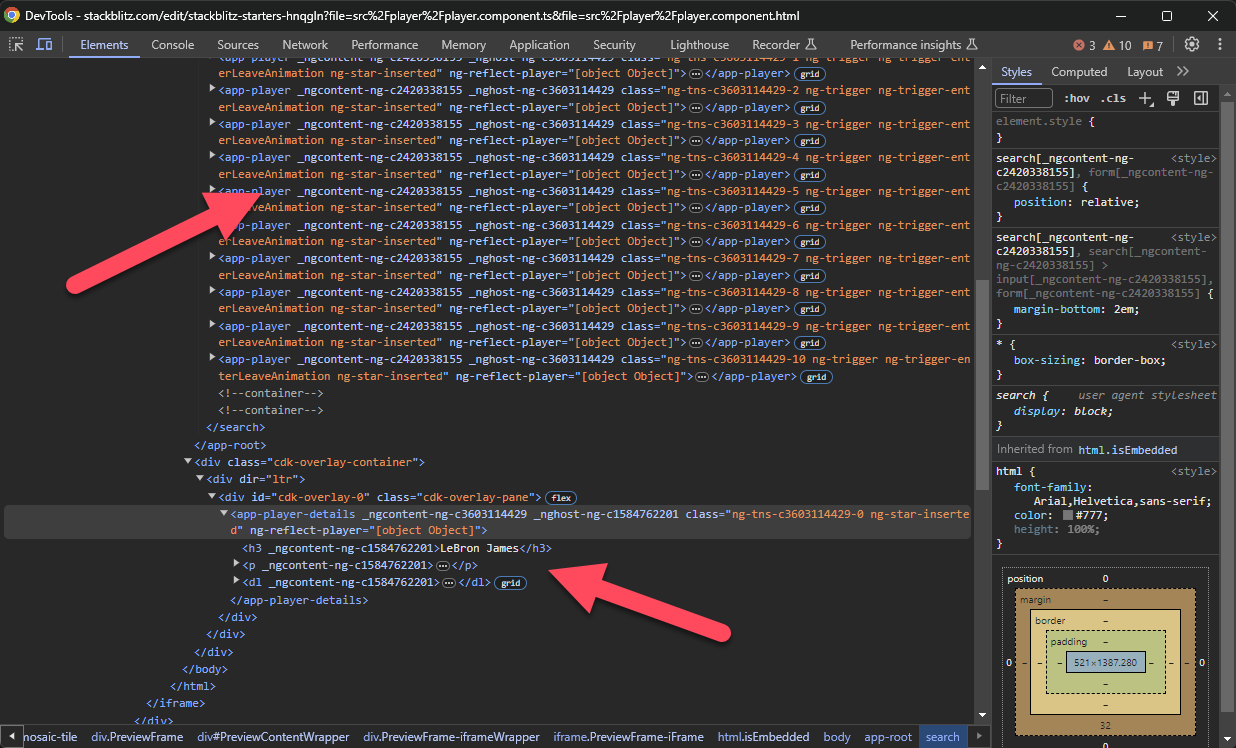
This is what ensures that this modal will properly be placed on a layer that is unaffected by anything else within our app. And that can be really handy in many modal situations.
How to Customize the Angular Overlay Settings With a Custom Overlay Config Object
Now, like I mentioned earlier, there’s a lot of functionality and configuration available with the Overlay Module. Like for example, if we want to position our modal in the center of the viewport. We can do this by passing a custom configuration object to the overlay.
To do this let’s create a config variable. This will be set to a new OverlayConfig object. We’ll need to make sure that class is imported. Within this, we’re going to set the positionStrategy for the overlay.
We’ll add this.overlay, then we’ll call the position() method. It’s going to be a global() position which just means that it will be positioned relative to the viewport and not any specific element. From there we’ll call centerHorizontally(), and then centerVertically().
Let’s also set a width of sixty percent to keep it from growing too wide. Then, we can pass this custom config in our create method. The items we’ve included in this custom config will now override the default values for those properties.
...
import { ..., OverlayConfig } from '@angular/cdk/overlay';

export class PlayerComponent {
    ...
    protected openModal() {
        const config = new OverlayConfig({
            positionStrategy: this.overlay.position().global().centerHorizontally().centerVertically(),
            width: '60%'
        });
        const overlayRef = this.overlay.create(config);
        overlayRef.attach(this.portal);
    }
}
Ok, let’s check it out.

Looking pretty good right?
How to Close an Angular CDK Overlay on a Backdrop Click
Now, what if we want to put up a layer over the viewport when the modal is open, and when we click on that layer we want to close the modal? Well, we can do this by adding more custom configuration in our OverlayConfig. We can add hasBackdrop true. This will add a backdrop element to our overlay.
Now, to close the modal when this backdrop gets clicked, we have a backdropClick() method on our overlay ref that we can call. This method returns an observable that will fire every time the backdrop is clicked as long as it is open, so we can subscribe. Then in the callback here we will close our overlay by calling overlayRef.detach().
...
export class PlayerComponent {
    ...
    protected openModal() {
        const config = new OverlayConfig({
            ...
            hasBackdrop: true
        });
        ...
        overlayRef.backdropClick().subscribe(() => overlayRef.detach());
    }
}
Now let’s try this.
Cool, it closes when we click on this backdrop. Now, there’s a ton more available to us here so I’ll save it for a future post. Just know that there’s quite a bit more functionality and configuration available to you if needed.
For now, let’s look at an example of a Connected Position overlay.
Creating a Pop-up With a Connected Position Angular CDK Overlay
Creating a “connected position” overlay means is that our pop-up, instead of being globally positioned within the viewport, will be positioned relative to the button that we clicked on to open it. As if it’s attached to it. For this, we can use a couple of directives provided by the Overlay module instead of using the Overlay service.
We’ll use the cdkOverlayOrigin directive which will be applied to the item that we want to position from, in our case, our button. And then, we’ll use the cdkConnectedOverlay directive that will be applied to the ng-template that we want to inject into our popup.
For this example, since we’ll be using these directives, we can actually remove most of what we added when we were using the Overlay service. Well get rid of the @ViewChild, the constructor, and the openModal() function. We can also remove the PortalModule, CdkPortal, Overlay, and Overlay Config imports as well.
Now within the component template, we can replace the click binding on our button with the cdkOverlayOrigin directive.
<button cdkOverlayOrigin>
    ...
</button>
On the overlay ng-template, we can replace the cdkPortal directive with the cdkConnectedOverlay directive.
<ng-template cdkConnectedOverlay>
    ...
</ng-template>
Now we need to connect the overlay to the origin. To do this, the overlay has an input called cdkConnectedOverlayOrigin. We need to pass this input our origin directive instance. So we add a template reference variable, let’s call it trigger, on our origin button.
<button
    cdkOverlayOrigin
    #trigger="cdkOverlayOrigin">
    ...
</button>
Now we can pass this reference to the overlay with the cdkConnectedOverlayOrigin input.
<ng-template
    cdkConnectedOverlay
    [cdkConnectedOverlayOrigin]="trigger">
    ...
</ng-template>
To make this pop up open, we’ll use the cdkConnectedOverlayOpen input. This input expects a boolean value telling it whether it should be open or not. So, let’s add a property called detailsOpen, and initialize it to false.
...
export class PlayerComponent {
    protected detailsOpen = false;
}
We’ll toggle the property when the button is clicked using a click event binding.
<button
    cdkOverlayOrigin
    #trigger="cdkOverlayOrigin"
    (click)="detailsOpen = !detailsOpen">
    ...
</button>
Then, we can bind our cdkConnectedOverlayOpen input to this property on the overlay.
<ng-template
    cdkConnectedOverlay
    [cdkConnectedOverlayOrigin]="trigger"
    [cdkConnectedOverlayOpen]="detailsOpen">
    ...
</ng-template>
Ok, let’s give this a try.

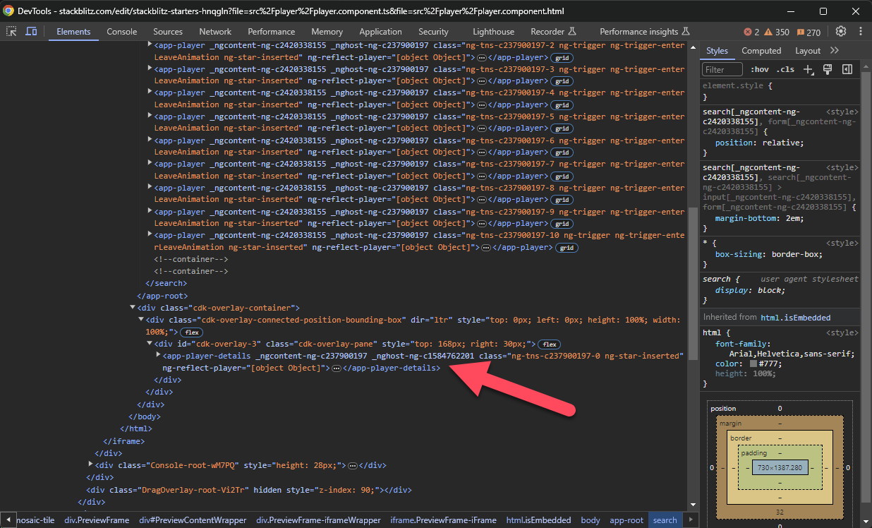
Cool, now it gets positioned next to the button. And, if we inspect this again, the markup gets injected in the same location, at the end of the body.
What’s even more cool, is that on the item at the bottom of the viewport, we will want it to open upward because we don’t have the room to see it if it opens downward. Well, if we click on the button we can see that this actually happens without us doing anything at all.

Super cool. This really saves us a ton of effort. All the tough stuff has already been figured out for us.
And just like the global positioning method, when using the Overlay service, there is a bunch of configuration available to us. This time, with the directives however, we use @Inputs and @Outputs.
So, if we want to add the width for example, we can use the cdkConnectedOverlayWidth input.
<ng-template
    cdkConnectedOverlay
    [cdkConnectedOverlayOrigin]="trigger"
    [cdkConnectedOverlayOpen]="detailsOpen"
    cdkConnectedOverlayWidth="60%">
    ...
</ng-template>
Now, the pop-up won’t grow beyond sixty percent of the width of its container.
And if we want to close this pop-up when we click anywhere outside we can use the overlayOutsideClick output which will fire when it detects a click outside of itself. When this happens, we can set our details open property to false.
<ng-template
    cdkConnectedOverlay
    [cdkConnectedOverlayOrigin]="trigger"
    [cdkConnectedOverlayOpen]="detailsOpen"
    cdkConnectedOverlayWidth="60%"
    (overlayOutsideClick)="detailsOpen = false">
    ...
</ng-template>
Now, when we open our pop-up, and then click outside, it closes.

Just like with the Overlay service, there’s a ton more available to us which I’ll save it for a future post. Just rememeber that there’s more functionality and configuration available outside of what I’ve covered here.
So, some pretty cool stuff is happening in these examples. It’s all actually quite complex from a development perspective, but there’s not much for us to figure out in order to leverage it thanks to the folks who built it.
Want to See It in Action?
Check out the demo code and examples of these techniques in the in the stackblitz example below. If you have any questions or thoughts, don’t hesitate to leave a comment.
Found any of this Stuff Helpful?
If you found any this helpful and want to show some love, you can always buy me a coffee!